Credit:
- David Mar, SE, graphic design
- Taline Mitten, production design, illustration
Published: FEMA P-58 Reports, 2018
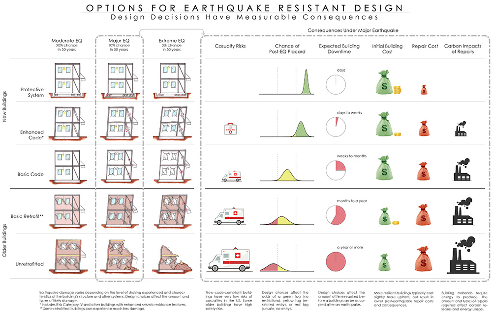
This chart was invented to tell the story of performance-based design to stakeholders who are not structural engineers. It helps stakeholders know what to expect during an earthquake and the choices that they have and how they can define the performance they want from their building. These stakeholders include municipalities, building owners, tenants, developers and anyone who interacts with a building. The chart is presented as a poster that tells the story of five buildings going through small, medium and large earthquakes in pictures. For example, at what point does a building have structural damage and non-structural damage, and when do the lights go out. Through icons the poster conveys all the important dimensions of building performance: safety, repair time, post-earthquake access, first cost-investments, cost of repair from losses, energy required to repair damage, and environmental impact.
The chart is a free public resource (in FEMA P-58-7) and shows up frequently in talks by engineers and researchers who use it as a communication tool. It is a special resource because the poster relies on the power of pictures and icons which are not the usual language for engineers. It conveys a complex technical subject through pictures and icons, showing relative performance relationships with simple concepts and ideas in an accessible way.
Related Research

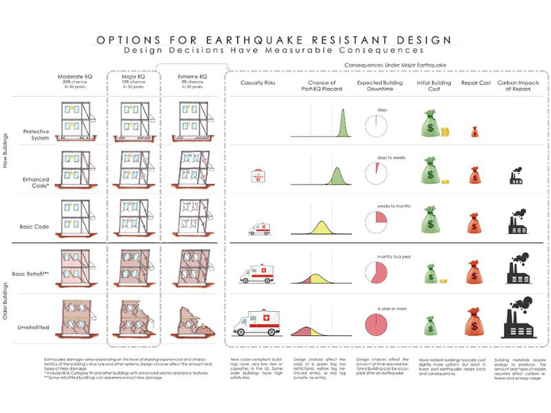
FEMA P-58: Options For Earthquake Resistant Design
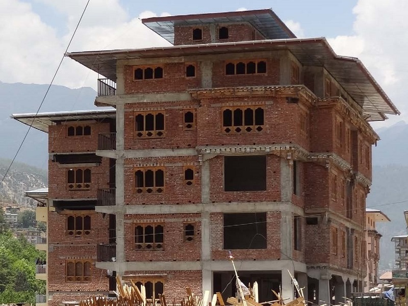
Conceptual Seismic Design Guidance for New Reinforced Concrete Framed Infill Buildings

Earthquake Safety Prioritization of School Buildings Using Performance-Based Risk Assessment in Kyrgyz Republic
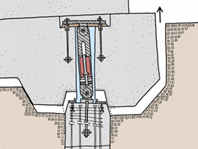
Casa Adelante: Rocking Mat Foundation System
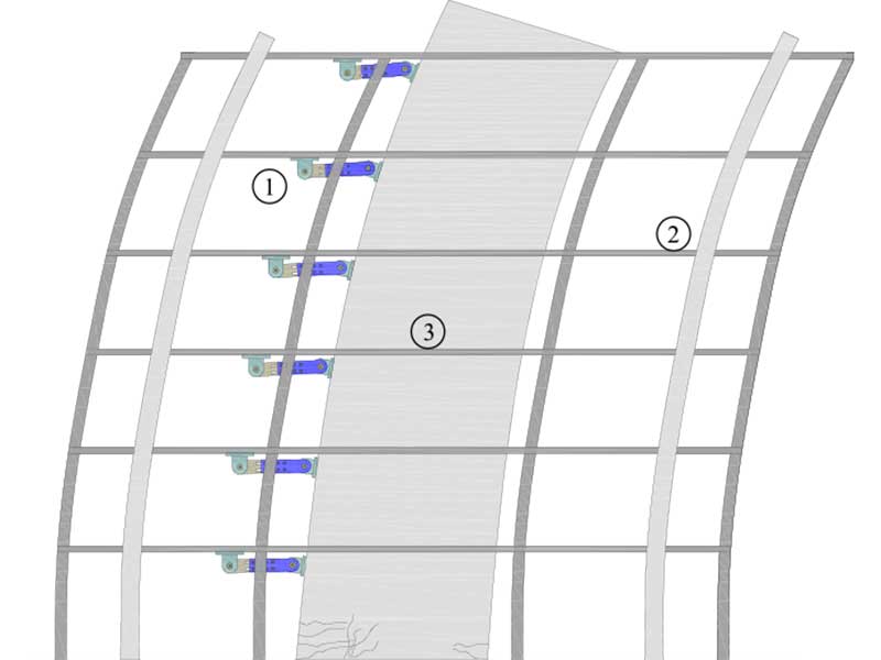
Development of Deformable Connection for Earthquake-Resistant Buildings to Reduce Floor Accelerations and Force Responses
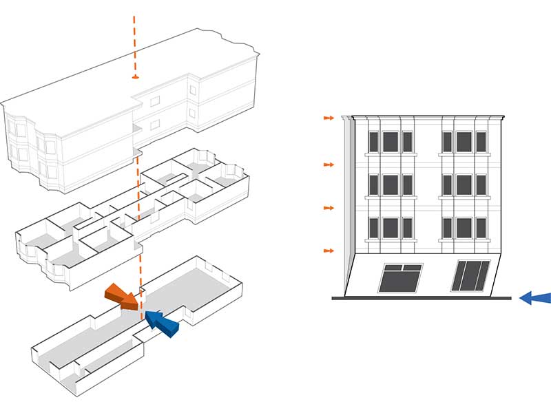
FEMA P-807: Guidelines for Seismic Retrofit of Weak-Story Wood-Framed Buildings
Design Examples Using Mode Shaping Spines for Frame and Wall Buildings
Recommended Mesh Anchorage Details for Straw Bale Walls
Reversed Cyclic In-plane Tests of Load-bearing Plastered Straw Bale Walls
